import matplotlib
if not hasattr(matplotlib.RcParams, "_get"):
    matplotlib.RcParams._get = dict.get
4.2. Noise and stochastic model#
In the previous section you have learned about the different components that can be present in a time series. Removing all these components, i.e. the functional model, we will be left with the residual term \(\epsilon(t)\). In this section we will take a closer look at the difference between signal and noise, and introduce other types of noise, not limited to traditional white noise.
Additional concepts#
In Signal Processing the data is just considered to be the signal of interest, whereas here we assume the data is “contaminated” with noise, i.e.
Time series analysis means understanding patterns and, hence, extracting the signal of interest from the noisy data.
Signal and noise#
How can we describe both signal and noise?
Signal - the meaningful information that we want to detect: deterministic characteristics by means of mathematical expressions to capture for example trend, seasonality and offsets.
Noise - random and undesired fluctuation that interferes with the signal: a stochastic process can describe this. For instance, when noise is time-correlated, each observation is affected not only by white noise but also by noise contributions from previous observations. We will see in Section Autoregressive process, that accounting for this stochastic time-correlation is essential for accurate prediction.
The following characteristics are associated with noise:
Noise is not synonymous with error, although random variation, including measurement errors, contributes to noise. Essentially, noise represents the unpredictable/uncontrollable fluctuations in data, while errors encompass any inaccuracies that may arise from a range of factors, including both random variations and systematic issues.
It is generally desired to filter out unwanted random variations, and detect meaningful information (i.e., a signal) from noisy processes. Transforming data from the time domain to the frequency domain allows to filter out the typically high noise frequencies that pollute the data.
White noise can be decomposed into its constituent components (frequencies). In principle, white noise contains all wavelengths/colors (like white light), each contributing equally to the fluctuations observed in the data. White noise has no time dependence.
Colored noise can seriously affect the analysis of time series, and the estimators for the parameters of interest. Colored noise has predictive property (used for forecasting).
A stationary zero mean purely random process (or white noise process) yields a sequence of uncorrelated zero-mean random variables. This zero-mean random process (without any signal) is of the form
where \(\epsilon(t)\) is the independent identically distributed (i.i.d.) error at epoch \(t\). Therefore, the observation/noise at time \(t\) is not dependent on any of the previous observations, such as \(Y_{t-1}\), \(Y_{t-3}\) and \(Y_{t-8}\).
The example in Fig. 4.22 shows that the signal can be described by \(\cos(2\pi f_1 t) + \sin(2\pi f_1 t)\). We add noise. The stochastic model (assuming independent normally distributed observations) would be a scaled identity variance matrix with variance equal to 1 (middle panel) and 9 (bottom panel), respectively. The signal of interest has been entirely hidden in the background noise in the bottom panel. Techniques from signal processing can be used to detect the ‘frequency’ (of the harmonic signal).
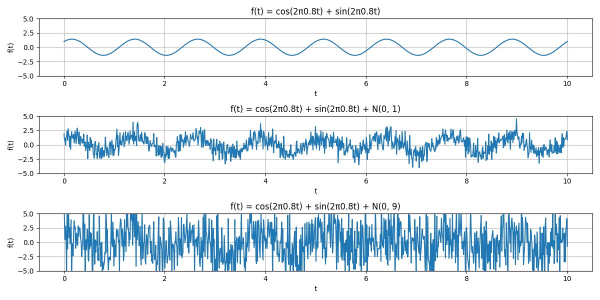
Fig. 4.22 Example of a time series (top graph) affected by noise with different strengths (middle and bottom figures).#
Signal to noise ratio#
In signal processing the signal to noise ratio is commonly used to report on the amount of noise present in the model. If we analyze the model \(Y = \text{signal} + \text{noise}\), and separate the functional and stochastic part, then \(Y\) is a random variable with \(E[Y] = E[\text{signal}] = \mu\) (with zero-mean noise), and its variance \(D(Y) = D(\text{noise}) = \sigma^2\) (with deterministic parameters in the functional model). Using this, the signal to noise ratio is often defined as:
The signal to noise ratio is a measure of how much the signal stands out from the noise. The higher the signal to noise ratio, the more the signal stands out from the noise. Better equipment or more data can increase the signal to noise ratio.
For the time series in Fig. 4.22, the amplitude \(A\) of the harmonic is used, thus, the SNR is defined as
White noise#
In the ideal case, when the signal is removed, we are left with white noise. A zero-mean white noise stochastic model has the following properties:
and
Most notable, all observations are uncorrelated (off-diagonal elements of the covariance matrix are equal to 0). When we compute the PSD, the resulting density will be flat over the entire range of frequencies. In other words, a white noise process has equal energy over all frequencies, just like white light. We will show this in the interactive plot at the bottom of this page.
Colored noise#
In time series analysis it is not guaranteed that the individual observations are uncorrelated. At the bottom of this page you will find an interactive plot. You can select four different types of noise: white, pink, red and blue. The noise processes are plotted in combination with the PSD. The PSD is a measure of the power of the signal at different frequencies. The white noise process has a flat PSD, while the other noise processes have a different shape. The pink noise process has a PSD that decreases with frequency, the red noise process has a PSD that decreases quadratically with frequency, and the blue noise process has a PSD that increases with frequency. The bottom-line is that the \(\Sigma_{Y}\) variance matrix generally is a fully populated matrix.
## create a white noise signal and plot it
import numpy as np
import matplotlib.pyplot as plt
import ipywidgets as widgets

# create a white noise signal
np.random.seed(0)
N = 1000
x = np.random.randn(N)

# Function to generate pink noise
def pink_noise(N):
    uneven = N % 2
    X = np.random.randn(N//2+1+uneven) + 1j * np.random.randn(N//2+1+uneven)
    S = np.sqrt(np.arange(len(X)) + 1.)  # +1 to avoid divide by zero
    y = (np.fft.irfft(X/S)).real
    if uneven:
        y = y[:-1]
    return y

# Function to generate red (brown) noise
def red_noise(N):
    return np.cumsum(np.random.randn(N))

# Function to generate blue noise
def blue_noise(N):
    uneven = N % 2
    X = np.random.randn(N//2+1+uneven) + 1j * np.random.randn(N//2+1+uneven)
    S = np.sqrt(np.arange(len(X)))  # no +1 here
    y = (np.fft.irfft(X*S)).real
    if uneven:
        y = y[:-1]
    return y
# BEGIN: white_noise function
def white_noise(N):
    return np.random.randn(N)


# Generate different noise signals
pink = pink_noise(N)
red = red_noise(N)
blue = blue_noise(N)
x = white_noise(N)
noise_options = ['Pink Noise', 'Red Noise', 'Blue Noise', 'White Noise']

# Create a dropdown menu for noise types
dropdown = widgets.Dropdown(
    options=noise_options,
    value='White Noise',
    description='Noise Type:',
)

# Function to update the plot based on selected noise type
def update_plot_dropdown(noise_type):

    plt.figure(figsize=(12, 4))
    plt.subplot(2, 1, 1)

    if noise_type == 'Pink Noise':
        plt.plot(pink, label='Pink Noise')
    elif noise_type == 'Red Noise':
        plt.plot(red, label='Red Noise')
    elif noise_type == 'Blue Noise':
        plt.plot(blue, label='Blue Noise')
    elif noise_type == 'White Noise':
        plt.plot(x, label='White Noise')

    plt.title(f'{noise_type} Signal')
    plt.xlabel('Time Index')
    plt.ylabel('Amplitude')
    plt.legend()
    plt.grid()

    plt.subplot(2, 1, 2)
    if noise_type == 'Pink Noise':
        plt.psd(pink, NFFT=2048, Fs=1, color='r', label='Pink Noise')
    elif noise_type == 'Red Noise':
        plt.psd(red, NFFT=2048, Fs=1, color='r', label='Red Noise')
    elif noise_type == 'Blue Noise':
        plt.psd(blue, NFFT=2048, Fs=1, color='r', label='Blue Noise')
    elif noise_type == 'White Noise':
        plt.psd(x, NFFT=2048, Fs=1, color='r', label='White Noise')

    # plt.yscale('log')
    plt.show()

widgets.interactive(update_plot_dropdown, noise_type=dropdown)
Note
If you are interested, you can read more about the different types of noise in the Wikipedia article. In here you can also listen to the different types of noise, which might give you a better understanding of the differences.
Attribution
This chapter was written by Alireza Amiri-Simkooei, Christiaan Tiberius and Sandra Verhagen. Find out more here.