Programming fundamental concepts: functions and matplotlib#
This assignment is not obligatory
Introduction#
In this tutorial we will focus on two main topics: creating and using our own Python functions and plotting data using Matplotlib.
Useful tools#
During coding, you will often need to look up how certain functions work. There are several useful tools to help you with this:
The Python documentation or library documentation such as NumPy and Pandas are great resources.
Online forums and communities such as Stack Overflow.
Functions#
Often creating and using functions can help to organize code, make it more readable, and facilitate code reuse. In Python, you can define a function using the def keyword, followed by the function name and parentheses. Here’s a simple example:
def greet(name):
    print("Hello, " + name + "!")
You can call this function with a specific argument:
greet("Alice")
This will output:
Hello, Alice!
Functions can also return values using the return statement. For example:
def add(a, b):
    return a + b
You can use the returned value like this:
result = add(5, 3)
print(result)
This will output:
8
In summary, functions are a fundamental building block in Python programming, allowing you to encapsulate code into reusable units.
\(\text{Task 8.1:}\)
Create a function that takes a list of numbers as input and returns the sum of the squares of the even numbers in the list.
def sum_of_squares_of_evens(numbers):
    return sum(x**2 for x in numbers if x % 2 == 0)

def sum_of_squares_of_evens_easy(numbers):
    result = 0
    for x in numbers:
        if x % 2 == 0:
            result += x**2
    return result

print(sum_of_squares_of_evens([1, 2, 3, 4, 5]))  # Output should be 20 (2^2 + 4^2)
20
\(\text{Task 8.2:}\)
In this task, we will explore mandatory and optional arguments in Python functions. Our function should get an optional argument that specifies whether to include odd numbers in the sum of squares.
def sum_of_squares_of_evens(numbers, include_odds=False):
    return sum(x**2 for x in numbers if x % 2 == 0 or (include_odds and x % 2 != 0))

def sum_of_squares_of_evens_easy(numbers, include_odds=False):
    result = 0
    for x in numbers:
        if include_odds:
            result += x**2
        elif x % 2 == 0:
            result += x**2
    return result

print(sum_of_squares_of_evens_easy([1, 2, 3, 4, 5]))  # Output should be 20 (2^2 + 4^2)
print(sum_of_squares_of_evens_easy([1, 2, 3, 4, 5], include_odds=True))  # Output should be 35 (1^2 + 2^2 + 3^2 + 4^2 + 5^2)
20
55
\(\text{Task 8.3:}\)
We will now create a function in a separate file functions.py. This function will remove all vowels from a given string.
def remove_vowels(input_string):
    vowels = "aeiouAEIOU"
    word_without_vowels = ""
    for letter in input_string:
        if letter not in vowels:
            word_without_vowels += letter
    return word_without_vowels

def remove_vowels_easy(input_string):
    vowels = "aeiouAEIOU"
    return ''.join(letter for letter in input_string if letter not in vowels)

remove_vowels("Hello World")
'Hll Wrld'
Matplotlib#
An important part of data analysis is visualization. Matplotlib is a widely used Python library for creating static, animated, and interactive visualizations. It provides a variety of plotting functions to create different types of graphs and charts. Throughout this course, you will be asked often to visualize your results.
It is essential to understand how to use Matplotlib effectively to present your data insights clearly and compellingly. Not every visualization is the same, but all visualisations should have the following components:
Title: A concise description of what the plot represents.
Labels: Descriptive labels for the x-axis and y-axis to provide context for the data being presented; do not forget to include units of measurement where applicable.
Legend: A legend to identify different data series or categories within the plot.
Gridlines: Optional gridlines to help interpret the data more easily.
Scaling: Optional scaling (e.g., logarithmic) to better represent the data.
Always think about the story you want to tell with your data and how best to convey that through your visualizations. The possibilities are endless, and creativity is key!
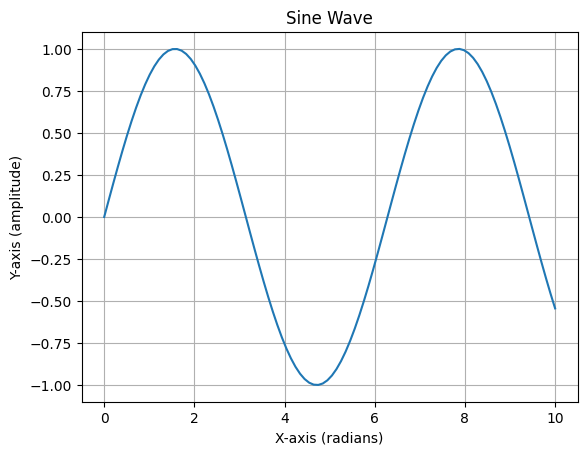
\(\text{Task 8.4:}\)
We will start easy, by creating a simple line plot using Matplotlib. First, ensure you have Matplotlib installed in your environment. You can install it via pip if you haven’t done so already:
pip install matplotlib
# import matplotlib and numpy

# create the data

# create the plot
# import matplotlib and numpy
import matplotlib.pyplot as plt
import numpy as np

# create the data
x = np.linspace(0, 10, 100)
y = np.sin(x)

# create the plot
plt.plot(x, y)
plt.title("Sine Wave")
plt.xlabel("X-axis (radians)")
plt.ylabel("Y-axis (amplitude)")
plt.grid()
plt.show()
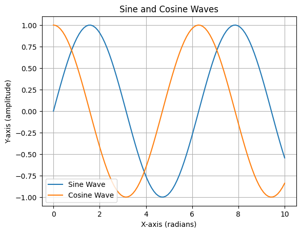
\(\text{Task 8.5:}\)
Lets say we also want to plot a cosine wave on the same graph. Modify the code to include the cosine wave.
# create the data
x = np.linspace(0, 10, 100)
y_sin = np.sin(x)
y_cos = np.cos(x)

# create the plot
plt.plot(x, y_sin, label='Sine Wave')
plt.plot(x, y_cos, label='Cosine Wave')
plt.title("Sine and Cosine Waves")
plt.xlabel("X-axis (radians)")
plt.ylabel("Y-axis (amplitude)")
plt.grid()
plt.legend()
plt.show()
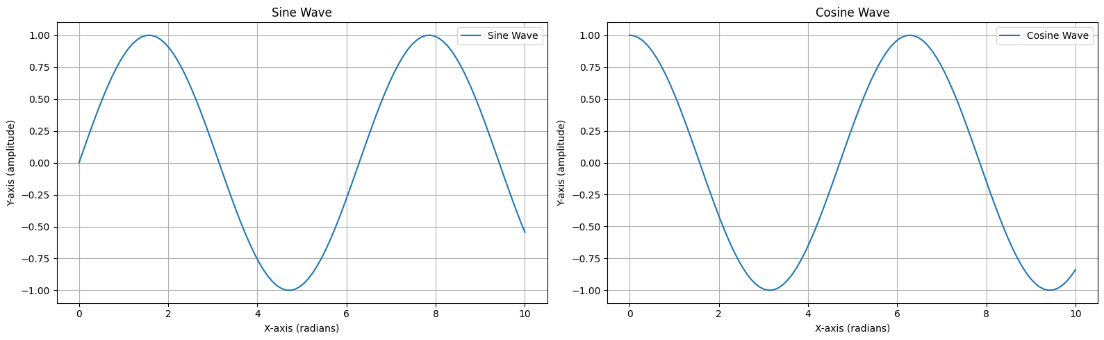
\(\text{Task 8.6:}\)
Now we will use a subplot to display the sine and cosine waves in separate plots. Subplots are very useful to compare different datasets side by side. finally, we would like to save our figure for the report.
# create the data
x = np.linspace(0, 10, 100)
y_sin = np.sin(x)
y_cos = np.cos(x)

# create the plot
plt.figure(figsize=(16, 5))

plt.subplot(1, 2, 1)
plt.plot(x, y_sin, label='Sine Wave')
plt.title("Sine Wave")
plt.xlabel("X-axis (radians)")
plt.ylabel("Y-axis (amplitude)")
plt.grid()
plt.legend()

plt.subplot(1, 2, 2)
plt.plot(x, y_cos, label='Cosine Wave')
plt.title("Cosine Wave")
plt.xlabel("X-axis (radians)")
plt.ylabel("Y-axis (amplitude)")
plt.grid()
plt.legend()

plt.tight_layout()
plt.savefig("sine_cosine_waves.png")
plt.show()
By Berend Bouvy, Delft University of Technology. CC BY 4.0, more info on the Credits page of Workbook.