Visualizing a Matrix#
Context#
For many scientific computing applications, in particular the field of numerical analysis, we formulate and solve our problems using matrices. The matrix itself is an arbitrary collection of values, however, the formulation and discretization of the problem will dictate a specific structure and meaning to the arrangement of the values inside a given matrix. When solving ordinary and partial differential equations with numerical schemes, we discretize space and time into discrete points or intervals, and the values of interest are specified by the elements of a matrix or vector. For example, a the variable \(y(x)\) can be discretized as y(x) = [y0, y1, y2, ... , yn], where each element yi refers to the \(i^\mathrm{th}\) spatial coordinate \(x_i\). For 2D problems, or perhaps problem with a temporal component (a dependence on time), we need to encode information in matrices. Thus, when implementing numerical schemes, it is important to be able to fill in the values of a matrix in an efficient and reliable way.
import numpy as np
import matplotlib.pyplot as plt
At this point you should be familiar with the Numpy library and its key data type the ndarray. In other words, it should be clear why executing something like this:
import numpy as np
x = np.array([1, 4, 7, 9])
returns something like this:
numpy.ndarray
If this is not clear, please refer to Numpy in the Learn Python book and attend future programming tutorials.
We’ll frequently use Numpy to create 2D arrays to represent matrices. Often one of the challenges of working with matrices is visualizing their contents, especially when the matrices become very large. Fortunately there is a Matplotlib method that makes visualizing matrices very easy: matshow. When using the conventional import statement import matplotlib.pyplot as plt, we can use this method as plt.matshow.
\(\text{Task 4.1:}\)
Use the Python help function to view the docstring (documentation) of the matrix visualization method.
help(plt.matshow)
Help on function matshow in module matplotlib.pyplot:

matshow(A: 'ArrayLike', fignum: 'None | int' = None, **kwargs) -> 'AxesImage'
    Display a 2D array as a matrix in a new figure window.

    The origin is set at the upper left hand corner.
    The indexing is ``(row, column)`` so that the first index runs vertically
    and the second index runs horizontally in the figure:

    .. code-block:: none

        A[0, 0]   ⋯ A[0, M-1]
           ⋮             ⋮
        A[N-1, 0] ⋯ A[N-1, M-1]

    The aspect ratio of the figure window is that of the array,
    unless this would make an excessively short or narrow figure.

    Tick labels for the xaxis are placed on top.

    Parameters
    ----------
    A : 2D array-like
        The matrix to be displayed.

    fignum : None or int
        If *None*, create a new, appropriately sized figure window.

        If 0, use the current Axes (creating one if there is none, without ever
        adjusting the figure size).

        Otherwise, create a new Axes on the figure with the given number
        (creating it at the appropriate size if it does not exist, but not
        adjusting the figure size otherwise).  Note that this will be drawn on
        top of any preexisting Axes on the figure.

    Returns
    -------
    `~matplotlib.image.AxesImage`

    Other Parameters
    ----------------
    **kwargs : `~matplotlib.axes.Axes.imshow` arguments
\(\text{Task 4.2:}\)
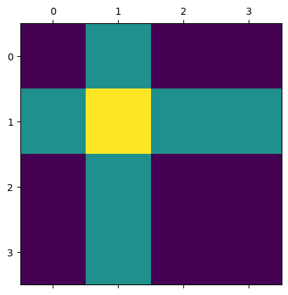
Run the cell below to visualize the A matrix. Change the values and rerun the cell to see the effect, especially noting that each “square” corresponds to an element in the matrix. Simple, right?!
A = [[1, 2, 1, 1],
     [2, 3, 2, 2],
     [1, 2, 1, 1],
     [1, 2, 1, 1]]

plt.matshow(A)
plt.show()
\(\text{Task 4.3:}\)
Run the cell below to see how a 100x100 matrix filled with random values looks.
A = np.random.rand(100, 100)
plt.matshow(A)
plt.show()
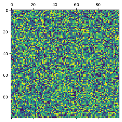
That’s pretty much all there is to it. Note that the axes indicate the row and column indices.
By Robert Lanzafame, Delft University of Technology. CC BY 4.0, more info on the Credits page of Workbook.