Creating subplots#
Purpose of this part is to demonstrate the use of plt.subplots.
Besides the creation of individual plots to visualise data or solutions, it is sometimes useful to create plots that are horizontally or vertically aligned.
This is done using plt.subplots. The plots can be regarded as elements of an array or matrix.
The data to be plotted comes from different functions as defined below.
\(\text{Task 5.1:}\)
Run the code below to define four functions and the range of x-values for which these functions will be calculated.
import numpy as np
import matplotlib.pyplot as plt
def linear(x):
    return x + 0.5

def quadratic(x):
    return x**2

def exponential(x):
    return np.exp(x)

def sine(x):
    return np.sin(x)

x = np.linspace(0, 2, 100)
Now, we will create a 2x2 matrix of plots with labels and gridlines. Each curve will labelled according to the function that is plotted.
\(\text{Task 5.2:}\)
Run the code below to create the four plots in a 2x2 setting.
fig, ax = plt.subplots(2, 2, figsize=(8, 6))
ax[0, 0].plot(x, linear(x), color='blue', label='linear')
ax[0, 1].plot(x, quadratic(x), color='orange', label='quadratic')
ax[1, 0].plot(x, exponential(x), color='green', label='exponential')
ax[1, 1].plot(x, sine(x), color='red', label='sine')
[ax[i, j].legend() for i in range(2) for j in range(2)]
[ax[i, j].grid(True) for i in range(2) for j in range(2)]
plt.show()
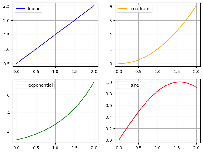
Although the horizontal axes are equal, the vertical axes are scaled differently.
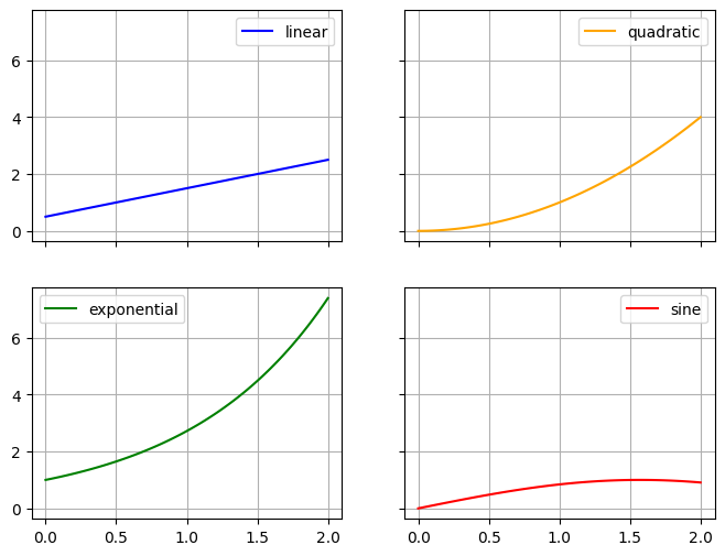
We can now use the sharex command to share the horizontal axis among plots above each other, and the sharey command to share the vertical axis among plots adjacent to each other.
This will also result in numerical values to be plotted only at the lowest x-axis and most left-hand y-axis, respectively.
\(\text{Task 5.3:}\)
Run the code below to create the four plots in a 2x2 setting using equal and aligned y-axes..
fig, ax = plt.subplots(2, 2, figsize=(8, 6), sharex=True, sharey=True)
ax[0, 0].plot(x, linear(x), color='blue', label='linear')
ax[0, 1].plot(x, quadratic(x), color='orange', label='quadratic')
ax[1, 0].plot(x, exponential(x), color='green', label='exponential')
ax[1, 1].plot(x, sine(x), color='red', label='sine')
[ax[i, j].legend() for i in range(2) for j in range(2)]
[ax[i, j].grid(True) for i in range(2) for j in range(2)]
plt.show()
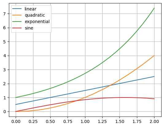
We can, or course, also plot the results of all four functions in a single diagram, which does not require plt.subplots.
plt.plot(x, linear(x), label='linear')
plt.plot(x, quadratic(x), label='quadratic')
plt.plot(x, exponential(x), label='exponential')
plt.plot(x, sine(x), label='sine')
plt.legend()
plt.grid(True)
plt.show()
By Ronald Brinkgreve, Delft University of Technology. CC BY 4.0, more info on the Credits page of Workbook.