Analysis Wind Gusts#
Case 1: Wind gust factor in Delft#
What’s the propagated uncertainty? How large is the wind gust factor?
In this project, you have chosen to work on the uncertainty of of the wind gust fraction at 10m height in Delft. You have observations of the wind gust speed \(G\) [m/s] and the baseline wind speed \(v\) [m/s] every hour for the entire month of August 2025. The data has been accessed from here. The wind gust factor \(F\) [-] is computed as the fraction
As you may have experienced yourself, the Netherlands can be a pretty windy place. The wind gust factor quantifies by what factor the wind gust top speeds exceed the base wind speed.
The goal of this project is:
Choose a reasonable distribution function for \(G\) and \(v\).
Fit the chosen distributions to the observations of \(G\) and \(v\).
Assuming \(G\) and \(v\) are independent, propagate their distributions to obtain the distribution of \(F\).
Analyze the distribution of \(F\).
Importing packages#
import numpy as np              # For math
import matplotlib.pyplot as plt # For plotting
from scipy import stats         # For math
from math import ceil, trunc    # For plotting

# This is just cosmetic - it updates the font size for our plots
plt.rcParams.update({'font.size': 14})
1. Explore the data#
The first step in the analysis is exploring the data, visually and through statistics.
Tip: In the workshop files, you have used the pandas .describe() function to obtain the statistics of a data vector. scipy.stats has a similar function.
import os
from urllib.request import urlretrieve

def findfile(fname):
    if not os.path.isfile(fname):
        print(f"Downloading {fname}...")
        urlretrieve('http://files.mude.citg.tudelft.nl/GA1.4/'+fname, fname)

findfile('dataset_wind_gusts.csv')
# Import the data from the .csv file
v, G = np.genfromtxt('dataset_wind_gusts.csv', delimiter=",", unpack=True, skip_header=True)
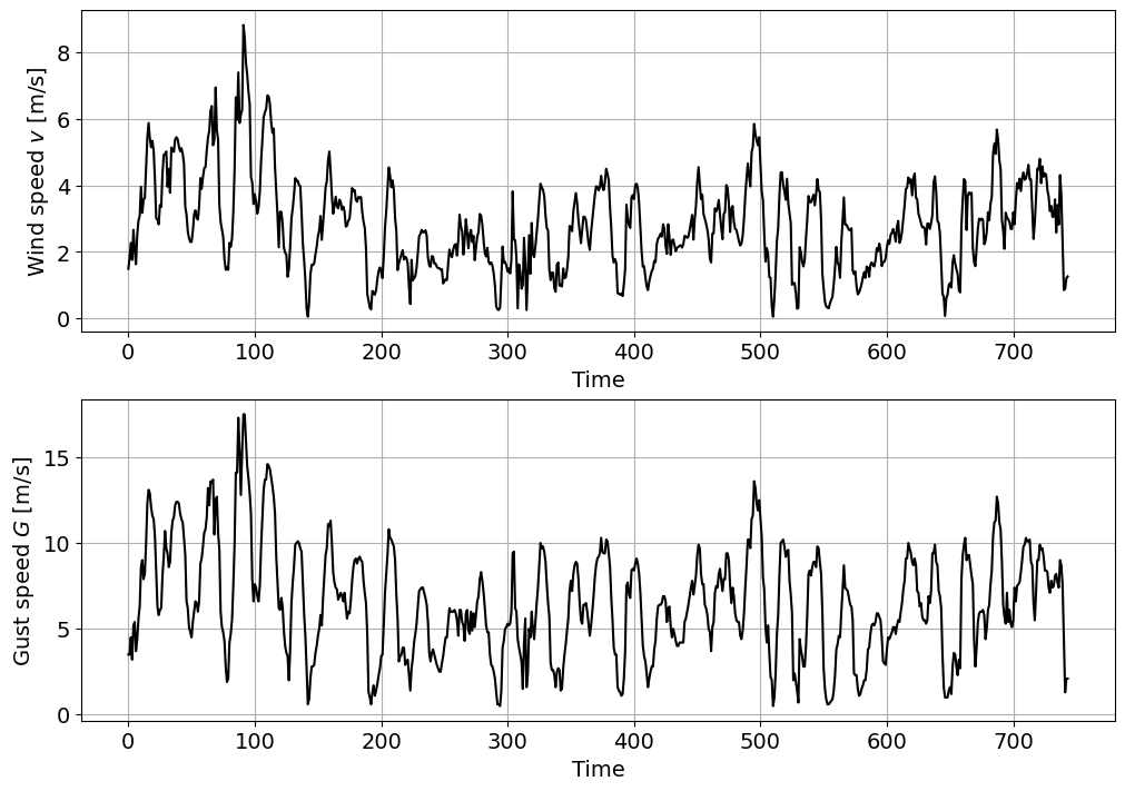
# Plot the time series for the wind speed v
fig, ax = plt.subplots(2, 1, figsize=(10, 7), layout = 'constrained')
ax[0].plot(v,'k')
ax[0].set_xlabel('Time')
ax[0].set_ylabel('Wind speed $v$ [m/s]')
ax[0].grid()
# Plot the time series for the wind gust speed G
ax[1].plot(G,'k')
ax[1].set_xlabel('Time')
ax[1].set_ylabel('Gust speed $G$ [m/s]')
ax[1].grid()
# Statistics for v
print(stats.describe(v))
DescribeResult(nobs=np.int64(744), minmax=(np.float64(0.05), np.float64(8.83)), mean=np.float64(2.8318817204301077), variance=np.float64(1.9896072215227423), skewness=np.float64(0.6355429263956981), kurtosis=np.float64(0.6572280584540016))
# Statistics for G
print(stats.describe(G))
DescribeResult(nobs=np.int64(744), minmax=(np.float64(0.5), np.float64(17.5)), mean=np.float64(6.538575268817204), variance=np.float64(10.18517212622469), skewness=np.float64(0.3777255226470491), kurtosis=np.float64(-0.01348835235383472))
Task 1:
Describe the data based on the previous statistics:
Which variable features a higher variability? Also consider the magnitudes of the different variables.
What does the skewness coefficient represent? Which kind of distribution functions should we consider to fit based on this coefficient?
Solution:
- Both variables have similar means (with the mean of $G$ being naturally larger) but different variances. To compare the variability of variables with different magnitudes, it can be useful to compute the coefficient of variation, which normalizes the standard deviation against the mean. If we do so, we obtain $CV(v)=\sigma/\mu=\sqrt{1.990}/2.832 = 0.498$ and $CV(G)=\sigma/\mu= \sqrt{10.185}/6.539 = 0.488$. Thus, we can see that $v$ and $G$ have approximately similar variability.
- Both $v$ and $G$ have a positive non-zero skewness, but the one for $v$ is a bit higher. Thus, the data presents a right tail and mode < median < mean. An appropriate distribution for $H$ and $G$ would be one which: (1) is bounded in 0 (no negative values of $H$ or $T$ are physically possible), and (2) has a positive tail. If we consider the distributions that you have been introduced to, the Lognormal, Gumbel, beta, or Exponential distributions would be possibilities.
2. Empirical distribution functions#
Now, we are going to compute and plot the empirical PDF and CDF for each variable. Note that you have the pseudo-code for the empirical CDF in the reader.
Task 2:
Define a function to compute the empirical CDF. Plot your empirical PDF and CDF.
def ecdf(observations):
    """Write a function that returns [non_exceedance_probabilities, sorted_values]."""
    sorted_values = np.sort(observations)
    n = sorted_values.size
    non_exceedance_probabilities = np.arange(1, n+1) / (n + 1)
    return [non_exceedance_probabilities, sorted_values]
fig, axes = plt.subplots(2, 2, figsize=(12, 12))

# Plot the PDF of v
axes[0,0].hist(v, edgecolor='k', linewidth=0.2, rwidth = 0.9,
             color='cornflowerblue', density = True, bins = 20)
axes[0,0].set_xlabel('Wind speed $v$ [m/s]')
axes[0,0].set_ylabel('density')
axes[0,0].set_title('empirical PDF of $v$')
axes[0,0].grid()

# Plot the PDF of G
axes[0,1].hist(G, edgecolor='k', linewidth=0.2, rwidth = 0.9,
             color='cornflowerblue', density = True, bins = 20)
axes[0,1].set_xlabel('Gust speed $G$ [m/s]')
axes[0,1].set_ylabel('density')
axes[0,1].set_title('empirical PDF of $G$')
axes[0,1].grid()

# Plot the empirical CDF of v
axes[1,0].step(ecdf(v)[1], ecdf(v)[0],
             color='cornflowerblue')
axes[1,0].set_xlabel('Wind speed $v$ [m/s]')
axes[1,0].set_ylabel(r'${P[X \leq x]}$')
axes[1,0].set_title('empirical CDF of $H$')
axes[1,0].grid()

# Plot the empirical CDF of G
axes[1,1].step(ecdf(G)[1], ecdf(G)[0],
             color='cornflowerblue', label='Gust speed $G$ [m/s]')
axes[1,1].set_xlabel('Gust speed $G$ [m/s]')
axes[1,1].set_ylabel(r'${P[X \leq x]}$')
axes[1,1].set_title('empirical CDF of $G$')
axes[1,1].grid()
Task 3:
Based on the results of Task 1 and the empirical PDF and CDF, select one distribution to fit to each variable.
For \(v\), select between a lognormal or exponential distribution.
For \(G\) choose between a Gaussian or beta distribution.
Solution:
\(v\): lognormal - Reasoning: both distributions have a right tail and a left bound, but the mode of the PDF is not at the left bound.
\(G\): beta - Reasoning: the distribution has a positive skewness, indicating that it is not symmetric; furthermore, a Gaussian distribution has no bounds and so may permit unphysical negative values.
3. Fitting a distribution#
Task 4:
Fit the selected distributions to the observations using MLE (Maximum Likelihood Estimation).
Hint: Use Scipy’s built-in functions (be careful with the parameter definitions!).
params_v = stats.lognorm.fit(v)
params_G = stats.beta.fit(G)

print(params_v)
print(params_G)
(np.float64(0.22598180137091714), -3.3517749583985994, np.float64(6.028063983701553))
(np.float64(2.807780435392252), np.float64(5.925889868329369), np.float64(-0.4108901768961072), np.float64(21.584951671227714))
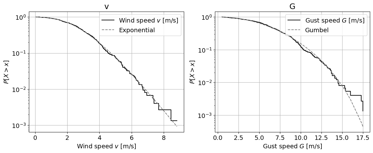
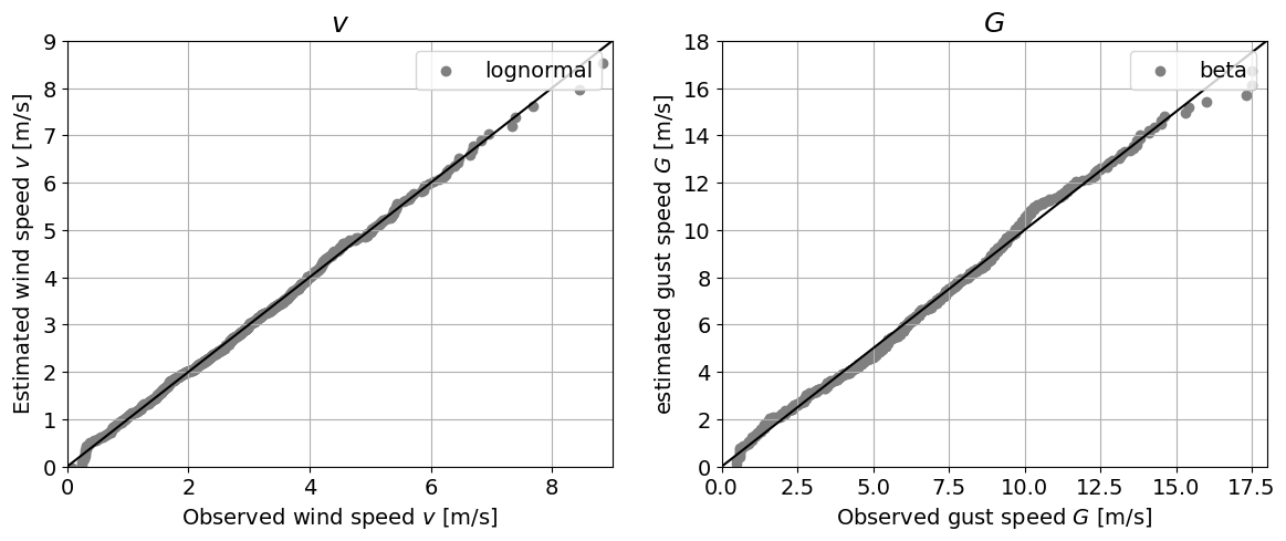
4. Assessing goodness of fit#
Task 5:
Assess the goodness of fit of the selected distribution using:
One graphical method: QQplot or Logscale. Choose one.
The Kolmogorov-Smirnov test.
Hint: The Kolmogorov-Smirnov test is implemented in Scipy.
# Graphical method

# Logscale
fig, axes = plt.subplots(1, 2, figsize=(14, 5))

axes[0].step(ecdf(v)[1], 1-ecdf(v)[0],
             color='k', label='Wind speed $v$ [m/s]')
axes[0].plot(ecdf(v)[1], 1-stats.lognorm.cdf(ecdf(v)[1], *params_v),
             '--', color = 'grey', label='Exponential')
axes[0].set_xlabel('Wind speed $v$ [m/s]')
axes[0].set_ylabel('${P[X > x]}$')
axes[0].set_title('v', fontsize=18)
axes[0].set_yscale('log')
axes[0].legend(loc = "upper right")
axes[0].grid()

axes[1].step(ecdf(G)[1], 1-ecdf(G)[0],
             color='k', label='Gust speed $G$ [m/s]')
axes[1].plot(ecdf(G)[1], 1-stats.beta.cdf(ecdf(G)[1], *params_G),
             '--', color = 'grey', label='Gumbel')
axes[1].set_xlabel('Gust speed $G$ [m/s]')
axes[1].set_ylabel('${P[X > x]}$')
axes[1].set_title('G', fontsize=18)
axes[1].set_yscale('log')
axes[1].legend(loc = "upper right")
axes[1].grid()
# QQ plot
fig, axes = plt.subplots(1, 2, figsize=(14, 5))

axes[0].plot([trunc(min(v)), ceil(max(v))], [trunc(min(v)), ceil(max(v))], 'k')
axes[0].scatter(ecdf(v)[1], stats.lognorm.ppf(ecdf(v)[0], *params_v),
             color='grey', label='lognormal')
axes[0].set_xlabel('Observed wind speed $v$ [m/s]')
axes[0].set_ylabel('Estimated wind speed $v$ [m/s]')
axes[0].set_title('$v$', fontsize=18)
axes[0].set_xlim([trunc(min(v)), ceil(max(v))])
axes[0].set_ylim([trunc(min(v)), ceil(max(v))])
axes[0].legend(loc = "upper right")
axes[0].grid()

axes[1].plot([trunc(min(G)), ceil(max(G))], [trunc(min(G)), ceil(max(G))], 'k')
axes[1].scatter(ecdf(G)[1], stats.beta.ppf(ecdf(G)[0], *params_G),
             color='grey', label='beta')
axes[1].set_xlabel('Observed gust speed $G$ [m/s]')
axes[1].set_ylabel('estimated gust speed $G$ [m/s]')
axes[1].set_title('$G$', fontsize=18)
axes[1].set_xlim([trunc(min(G)), ceil(max(G))])
axes[1].set_ylim([trunc(min(G)), ceil(max(G))])
axes[1].legend(loc = "upper right")
axes[1].grid()
# KS test
_, p_v = stats.kstest(v,stats.lognorm.cdf, args=params_v)
_, p_G = stats.kstest(G,stats.beta.cdf, args=params_G)

print('The p-value for the fitted distribution to v is:', round(p_v, 3))
print('The p-value for the fitted distribution to G is:', round(p_G, 3))
The p-value for the fitted distribution to v is: 0.579
The p-value for the fitted distribution to G is: 0.089
Task 6:
Interpret the results of the GOF techniques. How does the selected parametric distribution perform?
Solution:
Logscale plot: This technique allows to visually assess the fitting of the parametric distribution to the tail of the empirical distribution. For \(v\), the lognormal distribution fits very well in the tail. The beta distribution for \(G\) also yields an acceptable fit, but deviates from the empirical distributions in the right tail. Specifically, it underpredicts the exceedance probability of high wind speeds, which may lead to an underestimation of the risk of high wind speeds.
QQplot: Here, we can see that the fit of the parametric distribution to the empirical distribution is very good in both cases, with the only exception being the tails, as discussed in the logscale plot.
Kolmogorov-Smirnov test: remember that the test statistic measures the difference between two distributions. The p-value then represents the probability of observing a difference at least that large for a sample from the assumed distribution. If p-value is lower than the significance (\(\alpha=0.05\), for instance), the null hypothesis is rejected. Considering here \(\alpha=0.05\), we cannot reject the hypothesis that \(v\) comes from a lognormal distribution, or that \(G\) comes from a beta distribution.
5. Propagating the uncertainty#
Using the fitted distributions, we are going to propagate the uncertainty from \(v\) and \(G\) to \(F\) with a Monte Carlo approach assuming that \(v\) and \(G\) are independent.
Task 7:
Draw 10,000 random samples from the fitted distribution functions for \(v\) and \(G\).
Compute \(F\) for each pair of the generated samples.
Compute \(F\) for the observations.
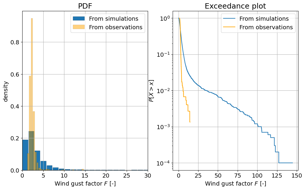
Plot the PDF and exceedance curve in logscale of \(F\) computed using both the simulations and the observations.
Hint: The distributions you have chosen may generate \(v\) or \(G\) values close to zero or even negative. Since you are computing a fraction, this may cause numerical issues. A hack to avoid that might be to set all values below a threshold, say, \(0.1\) [m/s] to the threshold value.
# Here, the solution is shown for the Lognormal distribution

# Draw random samples
rs_v = stats.lognorm.rvs(*params_v, size = 10000)
rs_G = stats.beta.rvs(*params_G, size = 10000)

print(rs_v)
print(rs_G)

# Threshold the values
rs_v = np.maximum(rs_v, 0.1)
rs_G = np.maximum(rs_G, 0.1)

# Compute F
rs_F = rs_G / rs_v

# Repeat for observations
F = G / v

# Plot the PDF and the CDF
fig, axes = plt.subplots(1, 2, figsize=(12, 7))
axes[0].hist(rs_F, edgecolor='k', linewidth=0.2, density = True, label = 'From simulations', bins = 100, rwidth = 0.9)
axes[0].hist(F, edgecolor='k', facecolor = 'orange', alpha = 0.5, linewidth=0.2, rwidth = 0.9, density = True, label = 'From observations', bins = 30)
axes[0].set_xlabel('Wind gust factor $F$ [-]')
axes[0].set_ylabel('density')
axes[0].set_xlim([0,30])
axes[0].set_title('PDF', fontsize=18)
axes[0].legend(loc = "upper right")
axes[0].grid()

axes[1].step(ecdf(rs_F)[1], 1-ecdf(rs_F)[0], label = 'From simulations')
axes[1].step(ecdf(F)[1], 1-ecdf(F)[0], color = 'orange', label = 'From observations')
axes[1].set_xlabel('Wind gust factor $F$ [-]')
axes[1].set_ylabel('${P[X > x]}$')
axes[1].set_title('Exceedance plot', fontsize=18)
axes[1].set_yscale('log')
axes[1].legend(loc = "upper right")
axes[1].grid()
[1.9903338  2.71050586 2.6431767  ... 3.70514274 2.163811   2.55268173]
[6.98064177 1.92556509 5.73502544 ... 8.16212266 4.04542986 3.26908535]
Task 8:
Interpret the figures above, answering the following questions:
Are there differences between the two computed distributions for \(F\)?
What are the advantages and disadvantages of using the simulations?
Solution:
In the PDF plot, we can see significant differences in the observed and simulated distributions for \(F\). The observed distribution is much narrower, and has wind gust factors that start at \(1\) and go into the tens. By contrast, the simulated distribution for \(F\) includes values below \(1\), which should not be possible: the gust speed cannot be lower than the wind speed, so we should always have \(F \geq 1\).
Similarly, we can see in both the PDF and CDF plots that the simulated wind gust factors are dramatically larger than the observed ones. This includes unrealistically large factors, some even reaching beyond 100, which seems scarcely physically possible.
Disadvantages: we are assuming that \(v\) and \(G\) are independent (we will see how to address this issue next week). In the case of the wind gust factor, intuition might already tell us that there should be a dependence between the variables. Neglecting this dependence yields the weird simulated results we have seen above. Advantages: I can draw all the samples I want allowing the computation of events I have not observed yet (extreme events; here, perhaps, even too extreme =P).
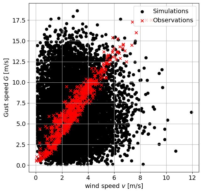
If you run the code in the cell below, you will obtain a scatter plot of both variables. Explore the relationship between both variables and answer the following questions:
Task 9:
Observe the plot below. What differences do you observe between the generated samples and the observations?
What can you improve into the previous analysis? Do you have any ideas/suggestions on how to implement those suggestions?
fig, axes = plt.subplots(1, 1, figsize=(7, 7))
axes.scatter(rs_v, rs_G, 40, 'k', label = 'Simulations')
axes.scatter(v, G, 40, 'r', marker = 'x', label = 'Observations')
axes.set_xlabel('wind speed $v$ [m/s]')
axes.set_ylabel('Gust speed $G$ [m/s]')
axes.legend(loc = "upper right")
axes.grid()
plt.savefig("scatterplot.png",dpi=300)
Solution:
As may be expected, the observations are focussed along a thin band, indicating strong positive correlation. By contrast, the simulations are spread much more broadly, freely combining wind and gust speeds of different velocities. This is a consequence of the assumption of independence in the simulations.
There is a correlation of \(0.953\) between the observed \(v\) and \(G\), indicating a strong (physical) dependence between the variables. On the contrary, as expected, no significant correlation is observed between the generated samples.
Some suggestions: The fit got \(v\) was already excellent, and also choosing a lognormal distribution for \(G\) might yield better results (we limited ourselves to a beta distribution here for the sake of the exercise). Accounting for the dependence between the two variables is an absolute must.
By Max Ramgraber, Patricia Mares Nasarre and Robert Lanzafame, Delft University of Technology. CC BY 4.0, more info on the Credits page of Workbook.