
Fitting probability distributions#
Fitting probability distributions to data is an important task in any discipline of science and engineering, as these distributions can be used to derive quantitative statements about risks and frequencies of uncertain properties. In this workshop, you will first work with a dataset of your choosing to estimate a distribution, and evaluate the quality of your fit. Then, you will build and analyze a contingency table that describes the relationship between two variables.
The goal of this project is:
Choose a reasonable distribution function for your chosen dataset, analyzing the statistics of the observations.
Fit the chosen distribution by moments.
Assess the fit computing probabilities analytically.
Assess the fit using goodness-of-fit techniques and computer code.
Build a contingency table from two variables and reason about their dependence.
The workshop is divided into 4 parts: 1) data analysis, 2) pen-and-paper practice, 3) programming, and 4) contingency tables.
import numpy as np
import matplotlib.pyplot as plt
from matplotlib.gridspec import GridSpec
import pandas as pd
from scipy import stats

plt.rcParams.update({'font.size': 14})
Please choose one of the following datasets:
Observations of the compressive strength of concrete. The compressive strength of concrete is key for the safety of infrastructures and buildings. However, a lot of boundary conditions influence the final resistance of the concrete, such as the cement content, the environmental temperature, or the age of the concrete.
ERA5 predictions of the hourly temperature at 2m height during the summer months (June, July, August) from 2005 to 2025. ERA5 predictions are re-analysis data, which are observation-corrected weather model predictions.
import os
from urllib.request import urlretrieve

def findfile(fname):
    if not os.path.isfile(fname):
        print(f'Downloading {fname}...')
        urlretrieve('https://github.com/TUDelft-MUDE/source-files/raw/main/file/'+fname, fname)

findfile('dataset_concrete.csv')
findfile('dataset_temperature.csv')
Downloading dataset_concrete.csv...
Downloading dataset_temperature.csv...
# Please choose one of the datasets below
viable_datasets = ['concrete', 'temperature']
dataset = 'concrete'  # Choose one dataset from the list above

assert dataset in viable_datasets, 'Dataset must be in {}.'.format(str(viable_datasets))

data = np.genfromtxt('dataset_{}.csv'.format(dataset), skip_header=1)

if dataset == 'concrete':
    label = 'Concrete compressive strength [MPa]'
    number_bins = 10
elif dataset == 'temperature':
    label = 'Summer air temperature in Delft [°C]'
    number_bins = 20
Now, let us clean and plot the data.
data = data[~np.isnan(data)]

plt.figure(figsize=(10, 6))
gs = GridSpec(nrows=1, ncols=2, width_ratios=[1, 0.2])

plt.subplot(gs[0, 0])
plt.plot(data, 'ok')
plt.xlabel('observation number'); plt.ylabel(label)
ylims = plt.gca().get_ylim()

plt.subplot(gs[0, 1])
plt.hist(data, orientation='horizontal', color='lightblue', rwidth=0.9, bins=number_bins)
plt.xlabel('frequency'); plt.gca().set_ylim(ylims)
(-1.6815630164000002, 86.6125956484)
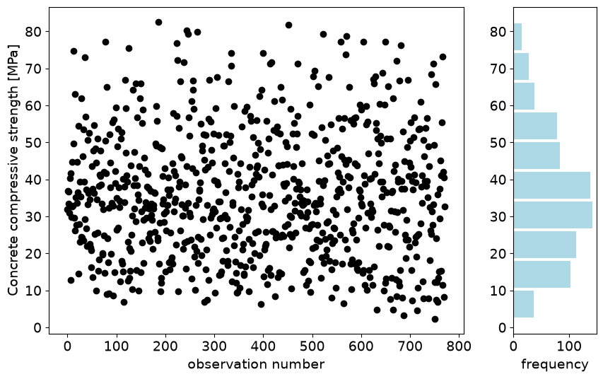
In the figure above, you can see all the observations of your chosen dataset. There is no clear pattern in the observations. Let’s see how the statistics look!
df_describe = pd.DataFrame(data)
df_describe.describe()
| 0 | |
|---|---|
| count | 772.000000 |
| mean | 35.724196 |
| std | 16.797389 |
| min | 2.331808 |
| 25% | 23.677591 |
| 50% | 33.870853 |
| 75% | 46.232813 |
| max | 82.599225 |
Task 1.1
Using ONLY the statistics calculated above:
Choose an appropriate distribution to model the data between the following: (1) Gumbel, (2) Uniform, and (3) Gaussian.
Justify your choice.
Solution
For the concrete dataset:
Appropriate distribution: Gumbel.
Uniform and Gaussian distributions are symmetric, so they are not appropriate to model the observations. We can see the asymmetry by computing the difference between the minimum value and the P50%, and between the maximum value and the P50%:
\(d_{\mathrm{min},50} = 33.87 - 2.33 = 31.54\)
\(d_{50,\mathrm{max}} = 82.60 - 33.87 = 48.72\)
Since \(d_{\mathrm{min},50} < d_{50,\mathrm{max}}\), the Gumbel distribution is right-tailed.
For the temperature dataset:
Appropriate distribution: Gumbel.
Uniform and Gaussian distributions are symmetric, so they are not appropriate to model the observations. We can see the asymmetry by computing the difference between the minimum value and the P50%, and between the maximum value and the P50%:
\(d_{\mathrm{min},50} = 17.0 - 6.5 = 11.5\)
\(d_{50,\mathrm{max}} = 36.7 - 17.0 = 19.3\)
Since \(d_{\mathrm{min},50} < d_{50,\mathrm{max}}\), the Gumbel distribution is right-tailed.
Part 2: Use pen and paper!#
Once you have selected the appropriate distribution, fit it by moments manually and check the fit by computing some probabilities analytically. Remember that you have all the information you need in the textbook. Do not use any computer code for this section — you have to do it with pen and paper. You can use the notebook as a calculator.
Task 2.1:
Fit the selected distribution by moments.
Solution:
For the concrete dataset:
Fitting by moments means equating the moments of the observations to those of the parametric distribution. Applying the expressions >for the mean and variance of the Gumbel distribution:
\(\mathbb{V}ar(X) = \frac{\pi^2}{6}\beta^2 \to \beta = \sqrt{\frac{6 \cdot 16.797^2}{\pi^2}} = 13.097\)
\(\mathbb{E}(X) = \mu + \gamma\beta \to \mu = 35.724 - 0.577 \cdot 13.097 = 28.167\)
where \(\gamma \approx 0.577\) is the Euler-Mascheroni constant.
For the temperature dataset:
\(\mathbb{V}ar(X) = \frac{\pi^2}{6}\beta^2 \to \beta = \sqrt{\frac{6 \cdot 3.733^2}{\pi^2}} = 2.911\)
\(\mathbb{E}(X) = \mu + \gamma\beta \to \mu = 17.407 - 0.577 \cdot 2.911 = 15.727\)
We can now check the fit by computing manually some probabilities from the fitted distribution and comparing them with the empirical ones.
Task 2.2:
Check the fit of the distribution:
Use the min, 25%, 50%, 75%, and max values. What are the non-exceedance probabilities (from the empirical distribution) that correspond to those values?
Compute the values of the random variable corresponding to those probabilities using the fitted distribution.
Compare the obtained values with the empirical ones and assess the fit.
Tip: to compute the predicted minimum and maximum, use the non-exceedance probability of the first and last rank sample in an empirical CDF (\(1/(n+1)\) and \(n/(n+1)\)).
Your answer here — fill in the table below.
Minimum |
P25% |
P50% |
P75% |
Maximum |
|
|---|---|---|---|---|---|
Non-exceedance prob. |
|||||
Empirical |
|||||
Predicted |
Solution:
For the concrete dataset (n=772):
Minimum
P25%
P50%
P75%
Maximum
Non-exceedance prob.
1/773
0.25
0.50
0.75
772/773
Empirical [MPa]
2.332
23.678
33.871
46.232
82.599
Predicted [MPa]
3.353
23.889
32.967
44.485
115.257
using the inverse Gumbel CDF: \(F(x) = e^{-e^{-(x-\mu)/\beta}} \to x = -\beta\ln(-\ln F(x)) + \mu\).
Assessment: the central values (P25/P50/P75) are well fitted. The left tail is reasonable (same order of magnitude). The right tail is poorly fitted — the predicted maximum is far from the observed maximum.
Solution:
For the temperature dataset (n=44160):
Minimum
P25%
P50%
P75%
Maximum
Non-exceedance prob.
1/44161
0.25
0.50
0.75
44160/44161
Empirical [°C]
6.5
14.9
17.0
19.5
36.70
Predicted [°C]
8.8
14.8
16.8
19.4
46.9
Assessment: same pattern — central values fit well, the right tail does not (the fitted Gumbel over-predicts the extreme high temperatures).
Part 3: Let’s do it with Python!#
Now, let’s assess performance with further goodness-of-fit techniques and see whether they are consistent with the analysis done by hand. Note that you have the pseudo-code for the empirical CDF in the reader.
Task 3.1:
Prepare a function to compute the empirical cumulative distribution function.
def ecdf(observations):
    """Return [non_exceedance_probabilities, sorted_values]."""
    sorted_values = np.sort(observations)
    n = sorted_values.size
    non_exceedance_probabilities = np.arange(1, n + 1) / (n + 1)
    return [non_exceedance_probabilities, sorted_values]
Task 3.2:
Transform the parameters of the selected distribution you fitted by moments to loc-scale-shape.
Hint: the distributions are listed in the online textbook, but check that the book’s formulation matches the Python package’s (see the Scipy.stats documentation).
Your answer here.
Solution:
The Gumbel distribution is already parameterized in terms of loc-scale. You don’t need to do anything — for either dataset.
Task 3.3:
Assess the goodness of fit of the distribution you fitted by moments by:
Visually comparing the empirical and fitted PDF.
Using the exceedance plot in log-scale.
Using the QQplot.
Interpreting them — do you reach a conclusion similar to Part 2?
# Visually compare the PDFs
if dataset == 'concrete':
    loc, scale = 28.167, 13.097
elif dataset == 'temperature':
    loc, scale = 15.727, 2.911

distribution = stats.gumbel_r.pdf(np.sort(data), loc, scale)

fig, axes = plt.subplots(1, 1, figsize=(10, 5))
axes.hist(data, edgecolor='k', linewidth=0.2, color='cornflowerblue',
          label='Empirical PDF', density=True, bins=number_bins)
axes.plot(np.sort(data), distribution, 'k', linewidth=2, label='Gumbel PDF')
axes.set_xlabel(label); axes.set_title('PDF'); axes.legend()
<matplotlib.legend.Legend at 0x7fe85791a3c0>
# Visually compare the exceedance probabilities
non_exceedance_probabilities, sorted_values = ecdf(data)
cdf = stats.gumbel_r.cdf(sorted_values, loc, scale)

fig, axes = plt.subplots(1, 1, figsize=(10, 5))
axes.step(sorted_values, 1 - non_exceedance_probabilities, color='k', label='Empirical')
axes.plot(sorted_values, 1 - cdf, color='cornflowerblue', label='Gumbel')
axes.set_xlabel(label); axes.set_ylabel('$P[X > x]$')
axes.set_title('Exceedance probability in log-scale'); axes.set_yscale('log')
axes.legend(); axes.grid()
# Visually compare the QQ plots
inverse_cdf = stats.gumbel_r.ppf(non_exceedance_probabilities, loc, scale)

fig, axes = plt.subplots(1, 1, figsize=(5, 5))
axes.scatter(sorted_values, inverse_cdf, color='cornflowerblue')
axes.set_xlabel('Observed ' + label); axes.set_ylabel('Estimated ' + label)
axes.set_title('QQplot')
xlims = axes.get_xlim(); ylims = axes.get_ylim()
lo, hi = min(xlims[0], ylims[0]), max(xlims[1], ylims[1])
axes.plot([lo, hi], [lo, hi], 'k')
axes.grid()
Solution:
For the concrete dataset:
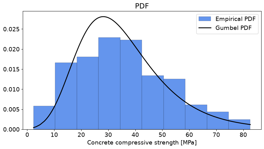
PDF comparison: the fitted distribution approximately follows the bell shape of the observations with a right tail, so Gumbel seems appropriate.
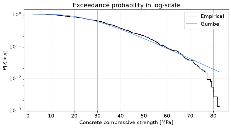
Log-scale plot: the tail of the empirical distribution is not well fitted — the Gumbel distribution over-predicts high compressive strength values. If we’re concerned about low strength, this is not the main issue; but if we care about how often very high strengths occur, the fitted distribution is overly optimistic.
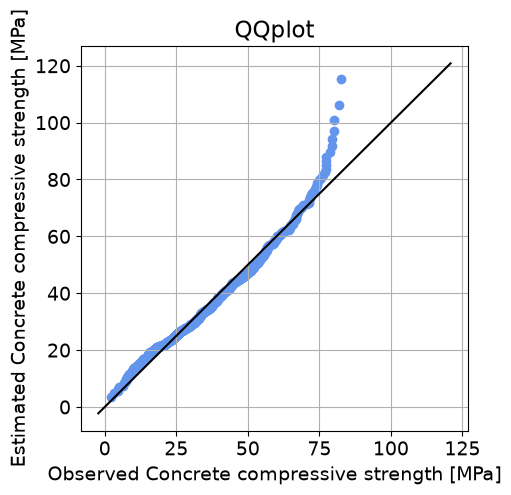
QQplot: good fit around the central moments and left tail, poor fit at the right tail.
These conclusions match Part 2 — the two approaches are equivalent, but the computer lets us reach more robust conclusions.
Solution:
For the temperature dataset:
PDF comparison: the fitted distribution approximately follows the shape of the observations with a right tail, so Gumbel again seems appropriate.
Log-scale plot: remember the y-axis is logarithmic — the Gumbel distribution over-predicts the probability of high temperatures in the right tail (on the safe side, if high temperatures are the concern). The left tail is hard to judge from this plot.
QQplot: good fit around the central moments; both tails deviate, with the distribution predicting more extreme temperatures than observed.
These conclusions match Part 2, as expected since the two techniques are equivalent.
End of Part 3. So far, everything you’ve fitted and assessed has been about a single variable at a time. In Part 4, we ask a different kind of question: how do two variables relate to each other? We’ll answer it using tables built directly from data, connecting to the discrete joint/marginal/conditional probability material from this week’s lecture.
Case: height and shoe size in this year’s MUDE class#
In Parts 1-3, you fitted a continuous parametric distribution to a single variable. Here, we look at two continuous variables at once — height and shoe size, from this year’s course questionnaire — and ask a new kind of question: not “what distribution fits each one on its own?”, but “how are they related?”. We’ll answer that using the discrete joint / marginal / conditional probability tools from Monday’s lecture, applied to height and shoe size after grouping each into a few categories.
The goal of this part is:
Look at the raw relationship between two continuous variables.
Turn each variable into a small number of categories.
Build a contingency table, and compute joint, marginal, and conditional probabilities from it.
Use those probabilities to informally check whether the two variables look independent.
A note on the data: dataset_class_survey_2026.csv only includes responses from students who agreed to let us reuse their answers in future years (112 of 127 respondents). No names, emails, or timestamps are included.
import numpy as np
import pandas as pd
import matplotlib.pyplot as plt

findfile('dataset_class_survey_2026.csv')

survey = pd.read_csv('dataset_class_survey_2026.csv')
survey[['height_cm', 'shoe_size']].describe()
Downloading dataset_class_survey_2026.csv...
| height_cm | shoe_size | |
|---|---|---|
| count | 112.000000 | 112.000000 |
| mean | 178.955357 | 42.125000 |
| std | 10.597797 | 3.549838 |
| min | 150.000000 | 24.500000 |
| 25% | 171.000000 | 40.875000 |
| 50% | 180.000000 | 43.000000 |
| 75% | 186.250000 | 44.000000 |
| max | 206.000000 | 50.000000 |
Task 4.1:
Make a scatter plot of
shoe_size(y-axis) againstheight_cm(x-axis). Do the two variables look related?
plt.figure(figsize=(6, 6))
plt.scatter(survey['height_cm'], survey['shoe_size'])
plt.xlabel('Height (cm)'); plt.ylabel('Shoe size'); plt.grid()
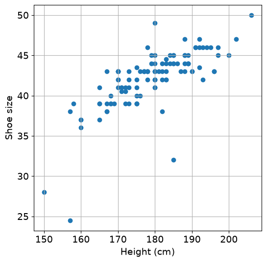
Solution: Taller students tend to have larger shoe sizes — a clear positive relationship, and a much stronger one than hair/eye color showed in the lecture example. But look closely at the very low end of the shoe sizes — something looks off.
Task 4.2 — clean the data first:
The questionnaire asked respondents to report their shoe size using the EU sizing system. Inspect the smallest values of
shoe_size. A few responses appear inconsistent with the requested scale and may have been entered using a different convention, such as foot length in centimetres.Identify those observations and decide how to handle them. State your cleaning rule explicitly before continuing.
print(np.sort(survey['shoe_size'].values)[:6])
# [24.5 28.  32.  36.  37.  37. ]
# The three values below 35 are implausible shoe sizes for an adult (in the EU shoe size scale, which was requested in the
# questionnaire) and are treated as data-entry errors / joke answers, not real observations.
survey = survey[survey['shoe_size'] >= 35]
[24.5 28. 32. 36. 37. 37. ]
Solution:
After cleaning, n = 109. Always state and justify a rule like this explicitly, rather than silently dropping points — someone else should be able to reproduce your cleaning decision.
We want to turn both continuous variables into three categories: Small, Medium, and Large.
For each variable, we divide the range from its minimum to its maximum into three intervals of equal width. Then we use pd.cut to assign each observation to one of the three categories. Finally, we store the resulting categories as new columns height_cat and shoe_cat in survey.
# Our labels for both categories
labels = ['Small', 'Medium', 'Large']

# Three bins have four edges: | 1 | 2 | 3 |
height_edges = np.linspace(
    survey['height_cm'].min(),
    survey['height_cm'].max(),
    4
)

# Three bins have four edges: | 1 | 2 | 3 |
shoe_edges = np.linspace(
    survey['shoe_size'].min(),
    survey['shoe_size'].max(),
    4
)

# Divide height into the bin categories
survey['height_cat'] = pd.cut(
    survey['height_cm'],
    bins=height_edges,
    labels=labels,
    include_lowest=True
)

# Divide shoe size into the bin categories
survey['shoe_cat'] = pd.cut(
    survey['shoe_size'],
    bins=shoe_edges,
    labels=labels,
    include_lowest=True
)

print('Height edges:', np.round(height_edges, 1))
print('Shoe-size edges:', np.round(shoe_edges, 1))

survey[['height_cm', 'height_cat', 'shoe_size', 'shoe_cat']].head()
Height edges: [157.  173.3 189.7 206. ]
Shoe-size edges: [36.  40.7 45.3 50. ]
| height_cm | height_cat | shoe_size | shoe_cat | |
|---|---|---|---|---|
| 0 | 168.0 | Small | 39.0 | Small |
| 1 | 177.0 | Medium | 43.0 | Medium |
| 2 | 175.0 | Medium | 39.0 | Small |
| 3 | 189.0 | Medium | 44.0 | Medium |
| 4 | 183.0 | Medium | 43.0 | Medium |
Solution:
This is the same binning approach used in the lecture (and in the Part 1 empirical-PDF pseudocode): fixed-width bins spanning the full range of the data, rather than bins chosen to contain equal numbers of observations. Note the two approaches can give quite different-looking tables further down — keep an eye out for that.
Task 4.3: Before building the full contingency table, calculate one entry manually.
How many students have both:
height_cat == 'Small', and
shoe_cat == 'Small'?Use Boolean indexing to count the observations satisfying both conditions. tore the result as
n_small_small.
n_small_small = (
    (survey['height_cat'] == 'Small')
    & (survey['shoe_cat'] == 'Small')
).sum()

print(n_small_small)
19
Solution:
19 students are (Small height, Small shoe size). This is exactly what \(\text{count}(\text{Small}, \text{Small})\) means in the lecture notation: a single cell of the contingency table, counted directly from the data.
Task 4.4:
You just counted one combination of categories manually. Pandas can repeat this operation for every combination at once using
.crosstab, which creates a full contingency table for you! The first argument defines the row categories and the second defines the column categories.We use the categorized columns in survey to construct the full contingency table, with height categories as rows and shoe-size categories as columns.
Verify that the Small / Small entry agrees with your result from Task 4.4.
Then convert the counts into joint probabilities by dividing the entire table by the total number of observations:
\[P(A,B)=\frac{\mathrm{count}(A,B)}{n}.\]
# Count every combination of height and shoe-size category
counts = pd.crosstab(
    survey['height_cat'],
    survey['shoe_cat']
)

# Check one entry against the count calculated manually in Task 4.4
assert counts.loc['Small', 'Small'] == n_small_small

print("Raw data table:")
print(counts)

# Divide every count by the total number of observations
joint = counts / counts.values.sum()

print("Joint probabilities:")
print(joint.round(3))
Raw data table:
shoe_cat    Small  Medium  Large
height_cat
Small          19      15      0
Medium          6      48      3
Large           0       8     10
Joint probabilities:
shoe_cat    Small  Medium  Large
height_cat
Small       0.174   0.138  0.000
Medium      0.055   0.440  0.028
Large       0.000   0.073  0.092
Solution:
Small
Medium
Large
Small
0.174
0.138
0.000
Medium
0.055
0.440
0.028
Large
0.000
0.073
0.092
With equal-width bins, the middle category ends up much larger than the two outer ones (most students cluster near the average height and average shoe size), so the table looks quite different from what you’d get with quantile-based bins — but the diagonal-heavy pattern (few students in the off-diagonal corners) is still clearly there.
Task 4.5:
The joint probability table describes height and shoe size jointly. Now compute the two marginal probability distributions:
the probability distribution of height category, regardless of shoe size;
the probability distribution of shoe-size category, regardless of height.
Compute each marginal distribution by summing the appropriate entries of the joint probability table. Check that each marginal distribution sums to 1.
Finally, think back to how we created the categories. We used intervals of equal width. If instead we had divided each variable into three groups using its empirical quantiles, approximately what would you expect the three marginal probabilities to be?
marginal_height = joint.sum(axis=1)
marginal_shoe = joint.sum(axis=0)
print(marginal_height)
print(marginal_shoe)
height_cat
Small     0.311927
Medium    0.522936
Large     0.165138
dtype: float64
shoe_cat
Small     0.229358
Medium    0.651376
Large     0.119266
dtype: float64
Solution:
marginal_height \(\approx [0.31, 0.52, 0.17]\), marginal_shoe \( \approx[0.23, 0.65, 0.12]\) (Small, Medium, Large). Unlike in quantile-based bins, these are not close to 1/3 each; equal-width bins do not give you equal-sized groups. Most students simply fall in the middle category for both variables.
Task 4.6:
So far, the marginal distribution of shoe size described the whole class.
Now consider only students in the Small height category. Among these students, what is the probability distribution of shoe-size category?
Then repeat the calculation for students in the Large height category.
Use the joint and marginal probabilities from the previous tasks. Recall that conditioning means restricting the population we are considering and renormalizing the corresponding probabilities.
shoe_given_small_height = (
    joint.loc['Small'] / marginal_height.loc['Small']
)

shoe_given_large_height = (
    joint.loc['Large'] / marginal_height.loc['Large']
)

print('Shoe size | Small height')
print(shoe_given_small_height.round(3))

print('\nShoe size | Large height')
print(shoe_given_large_height.round(3))
Shoe size | Small height
shoe_cat
Small     0.559
Medium    0.441
Large     0.000
Name: Small, dtype: float64

Shoe size | Large height
shoe_cat
Small     0.000
Medium    0.444
Large     0.556
Name: Large, dtype: float64
Solution:
For students in the Small height category,
Shoe-size category
Probability
Small
0.559
Medium
0.441
Large
0.000
For students in the Large height category,
Shoe-size category
Probability
Small
0.000
Medium
0.444
Large
0.556
Each conditional distribution sums to 1 because, once we condition on a height category, that height group becomes the population over which the shoe-size probabilities are defined.
The two distributions are clearly different: among students categorized as Small in height, Small and Medium shoe sizes dominate, whereas among students categorized as Large in height, Medium and Large shoe sizes dominate.
Task 4.7:
Compare the marginal distribution of shoe size from Task 4.5 with the two conditional distributions of shoe size from Task 4.6.
If height category and shoe-size category were independent, what relationship would you expect between the marginal and conditional distributions?
Does that appear to be the case for these data? Support your conclusion with specific probabilities from your results.
Solution:
The marginal distribution of shoe-size category is approximately
\[[0.23,\ 0.65,\ 0.12]\]for Small, Medium and Large.
For students in the Small height category, the conditional distribution is approximately
\[[0.56,\ 0.44,\ 0.00],\]while for students in the Large height category it is approximately
\[[0.00,\ 0.44,\ 0.56].\]If height category and shoe-size category were independent, conditioning on height would not change the shoe-size distribution. We would therefore expect the conditional distributions to be approximately the same as the marginal distribution.
That is clearly not what we observe here. For example,
\[P(\text{shoe}=\text{Large})\approx0.12,\]whereas
\[P(\text{shoe}=\text{Large}\mid\text{height}=\text{Small})=0\]and
\[P(\text{shoe}=\text{Large}\mid\text{height}=\text{Large})\approx0.56.\]The categorized height and shoe-size variables therefore show a strong association in this sample.
Task 4.8 (optional / if you have time):
Try the same recipe (scatter → clean → bin into equal-width categories → contingency table → conditional probabilities) on another pair of variables in
dataset_class_survey_2026.csv:
two more continuous variables, e.g.
rent_eurvs.room_size_m2(also needs cleaning — check for implausible values first!)or two categorical variables, e.g.
hair_colorvs.eye_color(the original lecture example, for comparison), orcats_or_dogsvs.degree(equal-width binning doesn’t apply to these — they’re already categories) Which pairs show a strong dependence, and which look closer to independent?
### YOUR CODE HERE
End of Part 4.
You’ve now practiced the discrete counterpart of the fitting workflow from Parts 1-3: instead of fitting a continuous parametric distribution to one variable, you grouped two continuous variables into equal-width categories and built an empirical joint distribution directly from the counts, then used conditional probabilities to reason about dependence. On Friday, you’ll apply the same recipe — scatter plot, then bin into equal-width Low/Medium/High categories, then contingency table — to the two continuous variables in the group assignment.
By Max Ramgraber, Delft University of Technology. CC BY 4.0, more info on the Credits page of Workbook.